During a recent productivity analysis job for an operating underground mine 2JS Mining was able to convert their production delay data into a Time Usage Model (or TUM) format that they were more familiar with.
A Time Usage Model is simply a way of splitting production time or delays into different codes so these can be reported and analysed consistently. Most sites or companies have a TUM that looks something like this:

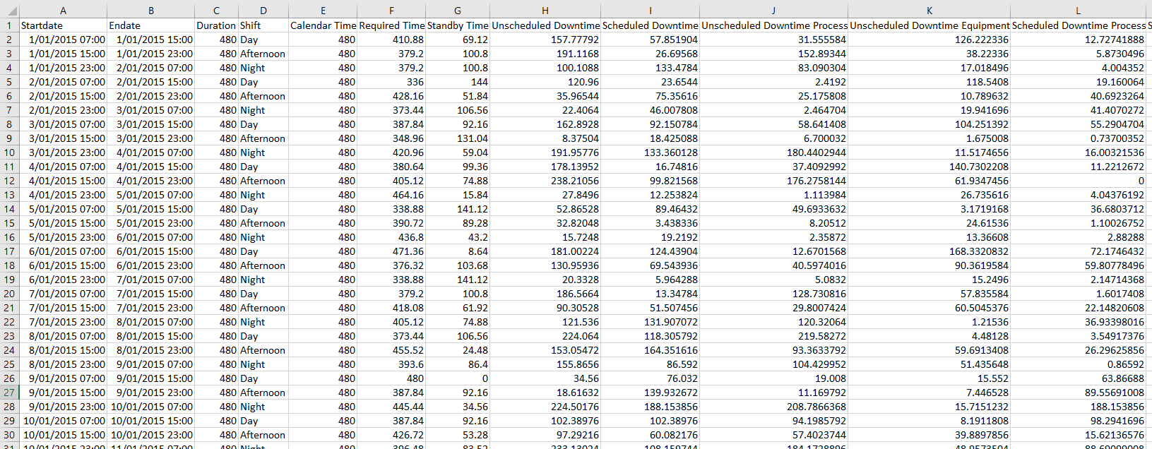
The data came as an excel spreadsheet. Note the data set below is completely made up for this example, however the format is typical for this kind of data. Usually there is a list that sits behind this spreadsheet, where each individual delay is allocated to a larger category – e.g. a broken down vehicle could be allocated to “Unscheduled Equipment Downtime“, or a crib room talk to “Scheduled Process Downtime“.

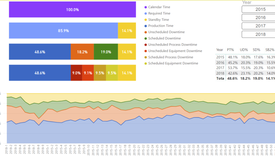
A filter for different years is created using chiclet slicers to make it easier to visualise the change between different years. The chart at the bottom of the dashboard shows the change of Scheduled and Unscheduled Downtime over time. If you hover over the individual points you can see the data for that week.
It is possible to go into Focus Mode to zoom in on a single visualisation by clicking on the button in the top right of each chart.
This dashboard was just a small aspect of visualising and understanding the data. Get in touch if you want to have a discussion about how we could help with your data.
