Mine sites all over the world are currently implementing dashboards to display their data. Power Bi has proven to be very easy to use and cost-effective and is often chosen as the software to build these dashboard.
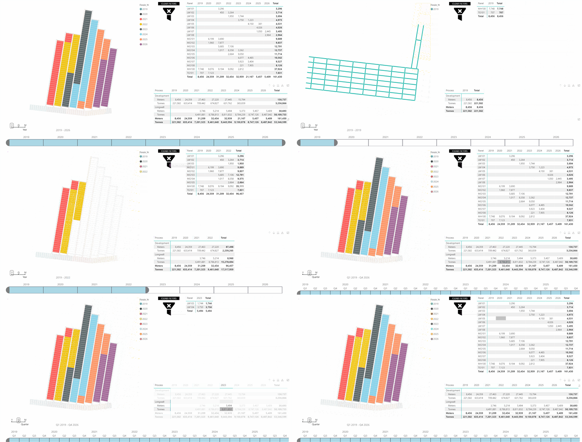
It is now possible to show and interact with CAD mine plans in Power BI. The examples below shows what areas are mined based on the selected period or location filter. All tables and selection sliders are completely interactive:

The same display of the mine plan can also be used to show and filter multiple properties – in this case seam thickness and a generic ‘zone’.
No more guessing where production took place or what local conditions were during a specific production period.

The Power BI interactive dashboard below has multiple ways to filter data:
- Using the time slicer at the bottom – switch between year/quarter or month
- Selecting table column or row headings
- Selecting individual cells
Get in touch if you want to have a discussion about how we could help with your data or if you have an idea on how this functionality could be improved.
