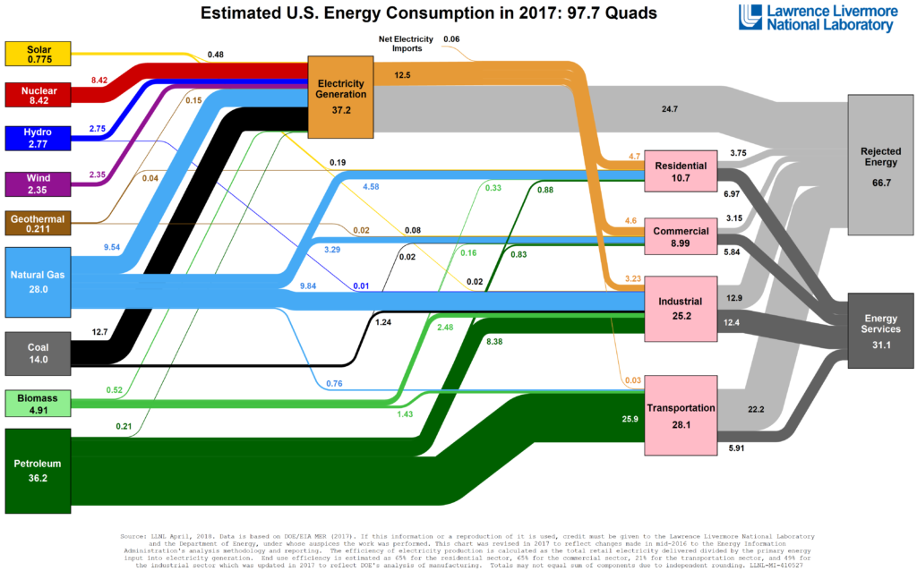
Based on an interesting discussion on a visualisation of the US Energy Consumption in Sankey format, I decided to replicate the chart below into an interactive version to see the change of the energy mix over several years.’

The LLNL Energy Flow Chart is created each year by the Lawrence Livermore National Laboratory.
Note: some of the table values are not entirely correct as in some instances the to and from for ‘Electricity Generation’ is not summarised for the entire flow.
Note 2: For simplicity the ‘Net Electricity Imports’ were omitted from the charts as it is not entirely clear where this flow should end up.
Source: Lawrence Livermore National Laboratory and the Department of Energy. Data at flowcharts.llnl.gov/commodities/energy
